cross-posted from: https://lemmy.capebreton.social/post/347724
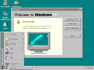
Windows 95 is a consumer-oriented operating system developed by Microsoft as part of its Windows 9x family of operating systems. The first operating system in the 9x family, it is the successor to Windows 3.1x, and was released to manufacturing on July 14, 1995, and generally to retail on August 24, 1995, almost three months after the release of Windows NT 3.51.
Windows 95 is the first version of Microsoft Windows to include taskbar, start button, and accessing the internet. Windows 95 merged Microsoft’s formerly separate MS-DOS and Microsoft Windows products, and featured significant improvements over its predecessor, most notably in the graphical user interface (GUI) and in its simplified “plug-and-play” features. There were also major changes made to the core components of the operating system, such as moving from a mainly cooperatively multitasked 16-bit architecture to a 32-bit preemptive multitasking architecture, at least when running only 32-bit protected mode applications.
Accompanied by an extensive marketing campaign,Windows 95 introduced numerous functions and features that were featured in later Windows versions, and continue in modern variations to this day, such as the taskbar, notification area, and the “Start” button. It is considered to be one of the biggest and most important products in the personal computing industry.
This has made a lot of people very angry and been widely regarded as a bad move.
Seriously though, this is the first properly good UI for a desktop computer. Mac OS (or I guess Macintosh OS at the time) was okay, but reliant on the global menu and weird drop-downs. Windows kept everything self-contained. Even multi-window programs tended to use the “multiple document interface,” i.e., windows inside windows. Tabs weren’t really a thing yet.
It also crashed if you looked at it funny and had the antivirus capabilities of warm cheese. But there’s damn good reasons Windows 7 was the same experience, extended, rather than replaced. It’s more-or-less what I style Linux to look like. And in light of that I’m kinda pissed off any OS ever struggles to remain responsive, when this relic ran smoothly on one stick of RAM that’s smaller than my CPU’s cache.
Mac OS (…) was okay, but reliant on the global menu and weird drop-downs.
See Fitt’s law for why the Mac’s menu bar is the way it is.
Thoroughly familiar with it; don’t care. The global menu has always been goofy because of the invisible relation to some open window. Usually a small window floating out in middle of the desktop, because Mac OS took forever to adopt any concept of “maximize.” I’m still not sure they do it right.
Nowadays macOS maximises like Windows does. Whether that’s “doing it right” is something else entirely.
Does it? I never pay attention to what version work has me running but hitting the maximize button is still exclusive full screen as effectively a new desktop
If you hold down one of the modifier keys, either Options/Alt or Cmd I don’t quite remember which, and then click the maximize button it does the normal Windows style maximize.
If you hold down one of the modifier keys
Lol this is my biggest beef with MacOS: the extent to which you have to memorize a bunch of utterly non-intuitive key combinations just to do basic tasks. Like taking a screenshot, which remains an absurd nightmare.
What’s the behavior when you double-click the title bar?
It usually maximizes it Windows style as well. I feel like I’ve had more inconsistency in behavior from that (like it would sometimes just fill the width but not the height), but nothing I can reproduce right now.
In its basic form, Fitts’s law says that targets a user has to hit should be as big as possible.
Dear god, my biggest beef with using a smart phone is that UI designers 1) love to have tiny buttons for shit, and 2) the tappable areas for those buttons are almost never made larger than their tiny graphics, so it’s a bitch to actually tap them.
I used to be a mobile app developer, and when I wrote apps by myself I would always expand the tappable areas so they were easy to hit with fat fingers. My last job was working for a huge cable company (maybe the name rhymes with “bombast”) and whenever I expanded the tappable area of a tiny button the UI designers would pitch a fit and insist that that not be done. Management would agree with them on the grounds that expanding the tappable area would require too much time to implement - and then they’d order me to spend even more time un-implementing it.
Something that irritates me in desktop design is, there’s a clickable icon. There’s no box around it to represent a button, just the icon on a blank background. You move your mouse towards the icon. When you get close to the icon, a box appears around it. You take this to mean “this object will be interacted with when you click the mouse.” You click the mouse. Nothing is achieved. You have to move the mouse into the actual borders of the icon, it’s just that now icons get visibly excited that you might pick them.
Windows 95 legitimately had better UI than that “Material” bullshit, via relief shading conveyed through four fucking colors. The hierarchy of elements is instantly visible. Buttons even popped in and out when clicked. There’s just no excuse for how minimalism fetishists have taken over user experience.
I find this problem to be especially pronounced in the exit buttons on in game ads.
Certainly windows took inspiration from the apple button in the upper left, but changed a few things so they wouldn’t get caught copying.
There’s only so many corners.
I think they actually tried to take MS to court, but lost since they had stolen the ideas from Xerox in the first place.
The movie Pirates of Silicon Valley does a great job at illustrating the basics of the story.
First off, Apple licensed the idea from Xerox, they didn’t steal it. Second, Apple lost because they had a badly worded contract with Microsoft for implementing Word for Mac that could be construed to allow them to copy the system’s API and thus UI.
IBM contract lawyers the day that was announced:
“OH FUCK! OH FUCK! OH FUCK!”
It really was a game changer. I remember the excitement of getting it for the first time after using windows 3.1.
The full screen app contained in a single window was great! I hated the Mac eat fo many windows floating around. My ADHD was so overwhelmed by all the tiny windows instead of a clear one.
mac os sucked ass
I remember the install CD had the Weezer “Buddy Holly” video on it. It felt pretty fancy
And “Good Times” by Edie Brickell, but for some reason nobody ever remembers that lol
Yeah, that was so cool. Watching a whole music video on a PC. Truly revolutionary.
Microsoft made no point to credit Edie Brickell in that video clip, they only credited Geffen Records.
I figure many if not most people probably didn’t even know who she was, other than the pretty woman that sang the nice relaxing song in the street.
I remember installing it on my PC using a large stack of 3.5" floppy disks. It was great - a big upgrade from Windows 3.11.
Yeah I remember that - it needed 13 discs and it always failed the last one and I would have to start all over.
I already had one of those fancy new-fangled CD-ROM drives. You could get a computer magazine with a cover-CD and it had all the patches for all current games and major software packages. So cool.
PC Gamer’s Coconut Monkey era.
And this marked the very first and last time I felt a sense of genuine excitement about an OS upgrade.
You weren’t stoked for XP? XP is the OS that got me into computing. Before XP computers were a novelty to me. When XP came out they finally seemed powerful enough to accomplish cool things with.
Launch of Windows 7 was pretty exciting too. Felt very modern, especially with the updated Aero UI.
I learned a lot with XP because it required constant trouble shooting. Was a buggy mess imo. I was more excited about hardware advancements and cool games at that time.
Nah not really. Win2k pro worked pretty well for me
MacOS X was freaking huge tho
I still have my Windows 95 “Start me up” Pogs!
You mean those little discs that you throw a bigger, heaver disc on top of? You’ve gotta share a pic sometime
I’m currently searching boxes. No one was taking them so they gave me like 20 of them.
I had to upgrade for the warcraft 2 level editor what a time to be alive!
My dad barely knew how to run things in windows 3.1 but he still regrets the day he installed windows 95 because it was all downhill from there when it came to him knowing what was going on.
I like how they selectively edited that so that you don’t hear Mick singing “You make a grown man cry”…
Microsoft marketing hasn’t gotten any better about song choices. A few years ago their ads had soft bleep-bloop tunes and “go baby, go baby, yeah we’re right behind you.”
The song is “Cherry Lips,” by Garbage. It’s the twink anthem.
And it’s still not as tone-deaf as whichever Bill Hicks target picked out “hey ho let’s go” from the god-damned “Blitzkrieg Bop.”
Here is an alternative Piped link(s): https://piped.video/watch?v=P0AJM6HMYjM
Piped is a privacy-respecting open-source alternative frontend to YouTube.
I’m open-source, check me out at GitHub.
C:/con/con
Haha I remember this. People who downvote you probably are too young to remember.
deleted by creator
Here is an alternative Piped link(s): https://piped.video/watch?v=hj6mfH-YO
https://piped.video/watch?v=hj6mfH-YO_4&
Piped is a privacy-respecting open-source alternative frontend to YouTube.
I’m open-source, check me out at GitHub.
You make a grown man cry:
Here is an alternative Piped link(s): https://piped.video/watch?v=4sH6lopuzdc
Piped is a privacy-respecting open-source alternative frontend to YouTube.
I’m open-source, check me out at GitHub.
I’m actually surprised it’s only 23 years go


