New Features and Updates
Refreshed UI design
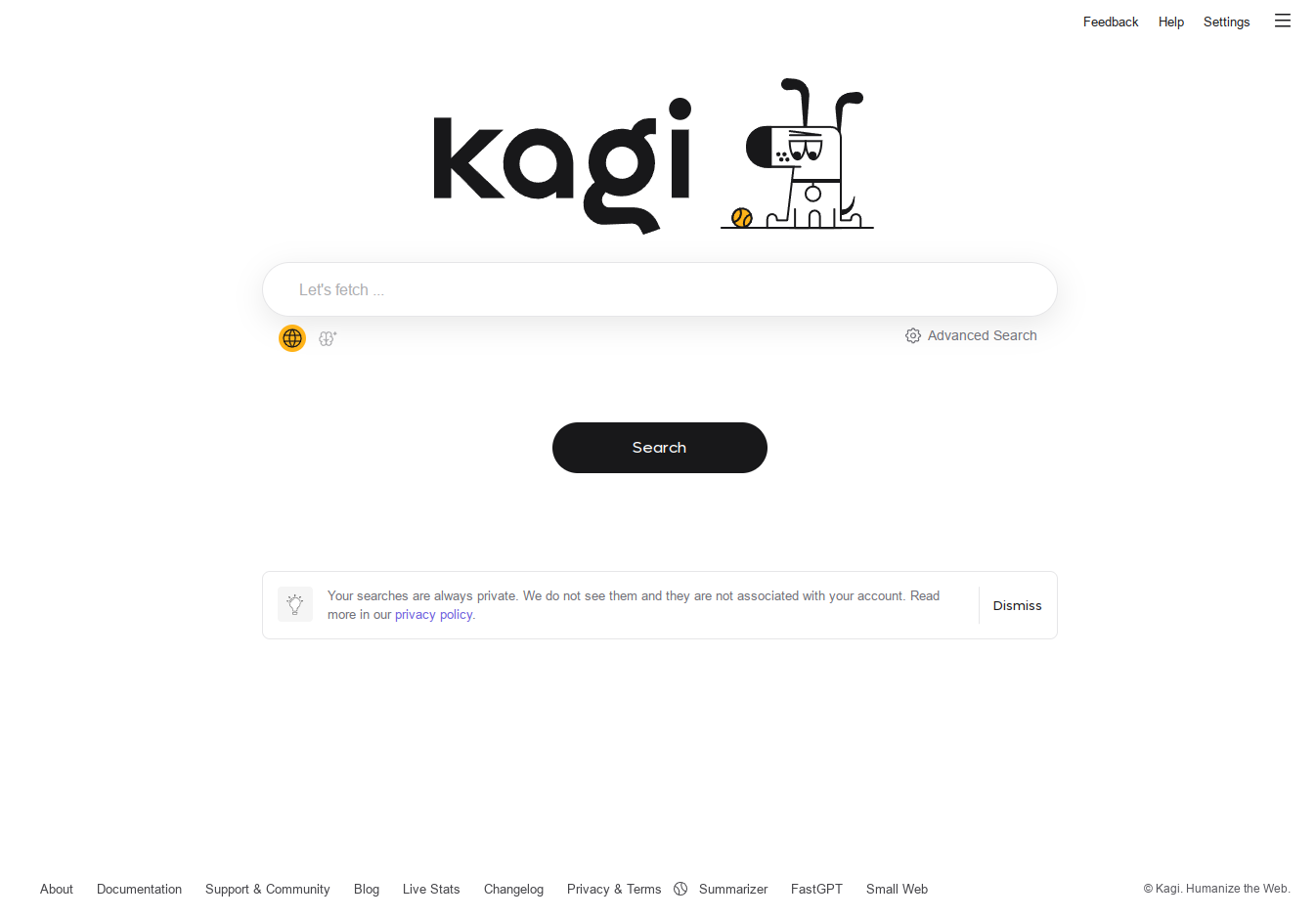
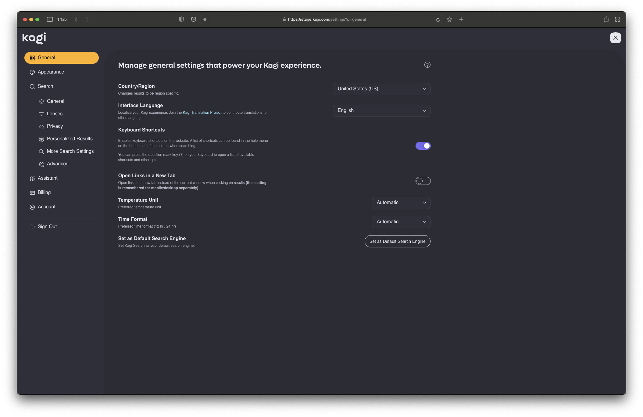
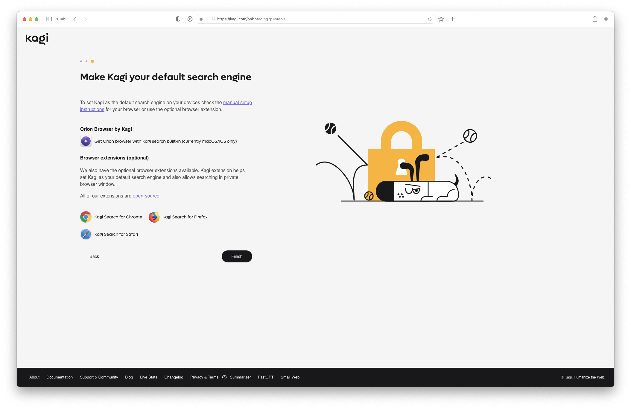
We’re delighted to unveil our updated design of key search pages and a completely revamped settings experience, now featuring a fresh, new look! Here’s a sneak peek:
Homepage

Settings

Onboarding

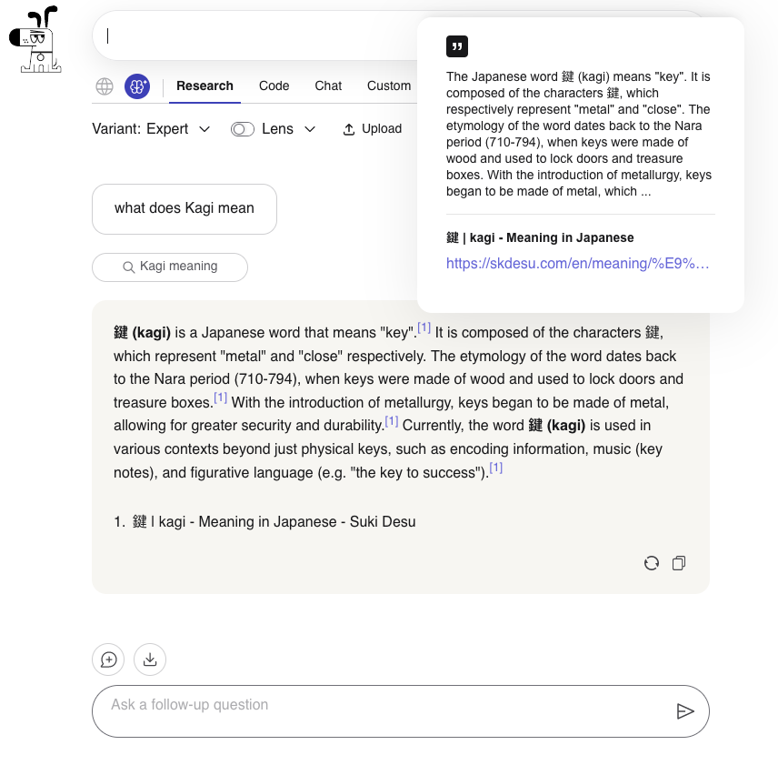
Assistant highlights
- New model available: added Google’s latest LLM, Gemini 1.5 Pro
- Privacy scores: we introduced an LLM privacy score (details on how it’s calculated)
- Enhanced citations: they now reference the segment of text used to
generate the cited content

Sales tax rollout
An update on our sales tax rollout plan. Effective today, sales tax will apply to all new customer accounts. For our existing customers, the implementation date is now set for April 16th. We will provide further details via email soon. In the meantime, if you have any questions, please don’t hesitate to contact our team via email at support@kagi.com or Discord.
Improvements and bug fixes
- Improved discussions lens results #3424 @raphael
- Some requests seem to take too much time to load #3752 @ak42
- Github repos from different orgs should not fold as subresults #149 @xvello
- Search suggestion details break input field #3727 @b-kaiser
- The search term variable, %s, is only evaluated once per bang #3698 @ph
- Small Web Lens does not honor blocked sites #3725 @markkrueg
- Kagi Knowledge wraps in middle of words #3702 @yeri
- Claude 3 Opus failing with “Sorry, a problem occurred while processing your request. Please try again later.” #3721 @ak42
- URL highlighting in assistant #3716 @cardinal086
- API/FastGPT keep failing on one particular query #3713 @frin
- Summarizer fails with a YouTube link #3704 @frin
- Research AI provides sources not in native language #3658 @bebowilson


The settings layout is a big step up but I’m not such a great fan of the theme changes. The new “Royal Blue” theme has lost quite a bit of contrast.
I already put in a feature request for true black…
Yeah I liked the previous dark theme. Not dark enough now with either of the options.
Guess you can theme it. Will have to play around with it.
https://help.kagi.com/kagi/features/custom-css.html
This one wasn’t horrible: https://github.com/Vexz00/kagi-nocturnal-theme
The box around each search result changes padding while I scroll giving it an odd “jelly” effect. At least on mobile anyways. Will have to mess with the CSS myself I guess.
Oh! I did not see these settings on mobile.
Had the exact same thought, not sure how it got approved, since it’s become a lot less readable.