
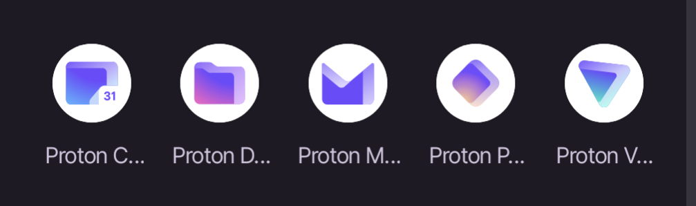
That the labels for the apps get truncated so you can only read “Proton” plus the first letter of the app. I’m only able to distinguish based on the icons which isn’t great because Pass and Drive are similar colors, and Pass and VPN, and Drive and Calendar are similar shapes.
Removed by mod
Removed by mod
Removed by mod
we are, yet we aren’t
Removed by mod
That needs to be acted, not said.
Removed by mod
They really be removing anything huh
There are certain rules, we all expect you to follow them. Come one, that one wasn’t even contributing.
.world moment