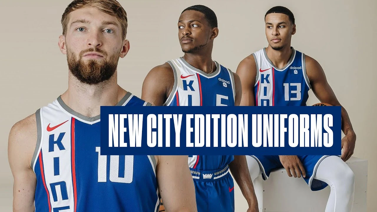
As we celebrate 100 years of royalty, we tip our crown to those who started it all 👑Prominently featuring royal blue, our primary color for seven decades, o...
I get the inspiration for the jerseys, and I don’t wanna pile on the general hate for City jerseys. But the execution is piss poor here. Would rather this look be reserved for the throwbacks with the “Royals” imprint.
I don’t agree, the only thing I truly don’t like is the gray trim. Whoever designs the Kings jerseys loves adding gray for some reason to everything even though gray looks awful on every jersey in existence. Big gray must be paying hella for this guy
would you prefer blue or red trim?
Probably blue, it would just look natural
The gray is a nod to the stone walls of the castles of medieval Sacramento.