

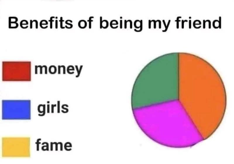
A picture of a pie chart. The title says “Benefits of being my friend.” The chart’s legend indicates money is the area in red, girls are labeled blue, and fame is labelled yellow. The pie chart has the colors green, orange, and purple, each roughly 33% of the pie chart. Orange is slightly larger, so maybe it’s 34%.
that’s how you get colorblind friends
I would argue that the orange portion is more like 5/12 of the chart. Try mentally splitting the thing in half and at least I find that the pink slice looks like a sixth of that half, or 1/12 of the whole thing. Thereby the orange part is 1/2 - 1/12 = 5/12 or approximately 42%
Which implies there are benefits to being your friend, it’s just not those 3.
“Did i tell you about my latest obsession? You’re going to love it!”
