

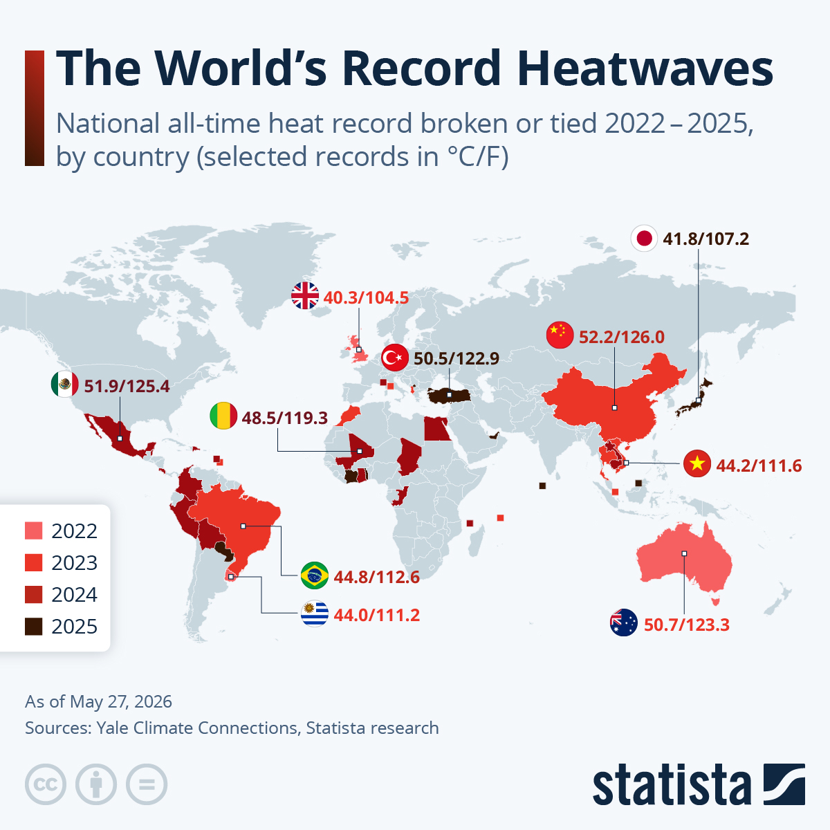
I was taught that if your visualization is less intuitive than a spreadsheet, you need to reevaluate your approach. Why the heck would you code the year of the occurrence in color?
This “data” raises more questions than provides info. Ridiculous.
Yeah and climate for two years, that doesn’t tell anything.
Vote right-wing. I’m sure it’ll solve it.
Obvious issues with this DataVis aside, the way I understand this, we’re going to be seeing 50°C+ way more regularly.
Way more people will die from heat in the coming years and only the rich are prepared.
What a shame you didn’t include 2021
… so far!
Holy shit, Mayotte on a world map. …or maybe it’s Comoros ?
It’s a cycle and us pumping millions of tons a year of carbon dioxide into the air doesn’t affect it.
In ten years we’ll be in an ice age and you’ll pray for global warming.
