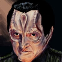
“No one will ever believe you, but that actually was the name of where I was stationed. I believe it is what you humans call ‘a humorous place name,’ such as ‘Intercourse, Pennsylvania’ and ‘Llanfairpwllgwyngyllgogerychwyrndrobwllllantysiliogogogoch’ in Wales.”
Llanfairpwllgwyngyllgogerychwyrndrobwllllantysiliogogogoch
I’ve been there!
Weather man nailing the name of the village: https://youtu.be/fHxO0UdpoxM
I’ve never been, but I’ve known of the name for years. It’s also a password in the movie Barbarella.
These panels really need to be mirrored. I kept reading the dialogue balloons out of order.
Typographical hierarchy and the graphical hierarchy of order aren’t things they teach you in design school for no reason.
I’m not much of an illustrator myself. I appreciate the work and talent and skill that goes into making these… but how do you get so good at making these without understanding some of the fundamentals of design and layout?
In comicbook word/thought bubbles, height in the panel always trumps laterality. It’s standard practice. You get used to it quickly.
Yes, but Tuvok’s bubbles are only barely lower than Paris’ bubbles. Since there isn’t significant white space above Tuvok’s bubbles, it’s easy to read those first even when you’re used to comics, especially since they’re in the upper left corner. Move Tuvok’s bubble in the first panel to between Tuvok’s and Paris’ heads and that one gets much easier to read. Panel four would also benefit from larger text size on Paris’ line.
If you have to insist something is obvious, it’s not.
I would agree.
But that’s not what I did.
In fact my mentioning that someone has to “get used to it” would directly acknowledge it isn’t obvious.Okay, rephrasing:
If you have to insist something is unremarkable, it’s not.
This comic is an example of someone fucking up the basics for comic dialog layout. Multiple people note that it’s ambiguous and could easily be improved. You can argue it’s reasonable. But you can’t take it for granted. Insisting on convention doesn’t mean anything when people plainly familiar with the convention say this fucked it up.
Again, I didn’t do that either.
I merely explained the standard convention.
I made no comment as to this comic specifically.
Agreed
It feels weird for Tuvok to call him “Paris” for some reason, but I also haven’t seen VOY in a long time. Did he usually refer to him as Lieutenant?
Also, this has to be an aftereffect of being Tuvix.
Yeah that hit me wrong too. I believe he often addresses him Lt. Paris or Mr. Paris.
Except when he was Ensign Paris for a little while.
Depends if you subscribe to the timeline that the biomimetic Paris was the one demoted instead of the real Paris.
Some people think that’s why for a few episodes, Paris can be seen with both lieutenant and ensign pips on his collar.
Paris looks like Vaultboy’s cousin in this
I get some capt holt vibes here.
This isn’t Seska, you’re just some common Kazon
Hhahahahahahahaahaha
This is awesome!
Font choice is poor
Is handwriting a font?


